
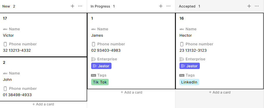
Kanban Style
Style is the section inside Smart Kanban that controls how cards and the kanban board look. It includes global visual settings and a conditional color system that lets you apply different card colors based on field values.
Capabilities
Set the background type of the kanban board
- Define a base card color
- Customize card stroke color
- Set card type (standard, super round, square, compacted, mosaic, or mosaic compacted)
- Show or hide the Add card button
- Hide fields with no value from cards
- Show or hide field icons and labels on cards
- Enable or disable title highlight on cards
- Enable or disable stage border color
- Control card size
- Apply conditional colors to cards based on rules
How to configure
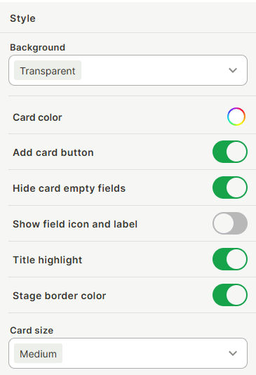
Background
Use the Background dropdown to set the background style of the kanban board. The Transparent option removes any background fill, letting the app page background show through.
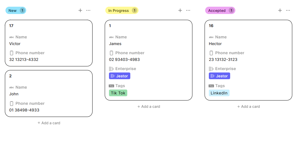
Card color
Click the color picker next to Card color to set the default background color for all cards on the board.
Card stroke color
Click the color picker next to Card stroke color to customize the outline color of all cards. This is useful for reinforcing brand colors, improving visual separation between cards in mosaic layout, or adding a personal aesthetic touch.
Card type
Use the Card type dropdown to control both the card shape and layout density. Available options are:
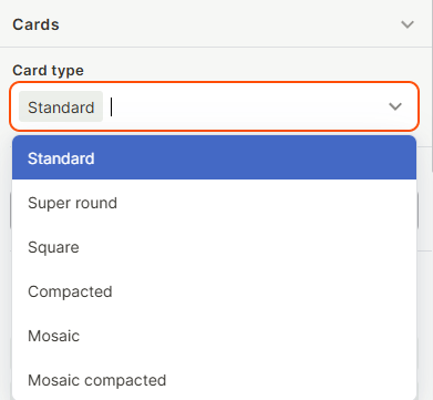
- Standard — the default style, with slight corner rounding and normal spacing.
- Super round — heavily rounded corners on cards and buttons, for a softer aesthetic.
- Square — no corner rounding, for a more structured, grid-like appearance.
- Compacted — reduces internal padding inside each card, removing dead space and fitting more cards vertically.
- Mosaic — removes the gap between cards, grouping them tightly together.
- Mosaic compacted — combines reduced internal padding with no gaps between cards, maximizing the number of cards visible on screen at once. Best for boards with a high volume of records.
Add card button
Toggle on to show a button at the bottom of each stage column that lets users create a new record directly from the kanban. Toggle off to hide it.
Hide card empty fields
When enabled, fields that have no value on a record are hidden from the card. This keeps cards clean when not all fields are filled in. When disabled, empty fields are shown with a blank value.
Show field icon and label
When enabled, each field on the card displays its icon and label name alongside the value. When disabled, only the value is shown, resulting in a more compact card layout.
Title highlight
When enabled, the record title on each card is visually emphasized. When disabled, the title is displayed with the same weight as other fields.
Stage border color
When enabled, each stage column displays a colored border that matches the stage color. When disabled, no border is shown.
Card size
Use the Card size dropdown to set the size of cards.
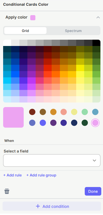
Conditional Cards Color
This section lets you assign card colors based on field values, overriding the default card color when conditions are met.
Click + Add condition to create a new conditional color rule. Each condition includes:
- Apply color — Select the color to apply to matching cards using the Grid (preset swatches) or Spectrum (full range) color picker.
- When / Select a field — Choose the field whose value will trigger this color.
- + Add rule — Add more criteria to this condition.
- + Add rule group — Add a grouped set of rules with independent logic.
Multiple conditions can be added. When a card matches a condition, its color is overridden with the assigned color.
Keep in Mind
- Conditional Cards Color overrides the base Card color when a condition is matched.
- Hide card empty fields affects only the card display — empty field values still exist in the record.
- Style settings apply to the entire kanban block — individual stages or cards cannot have different style settings outside of Conditional Cards Color.
- The Standard, Super round, and Square options in Card type are purely visual and do not affect how data is displayed or what fields are shown.
- The Compacted, Mosaic, and Mosaic compacted options in Card type affect spacing and density only — they do not change which fields appear on each card. Use Hide card empty fields and field conditionals to further control what data is shown.
- The actual number of extra cards visible with denser card types depends on screen size and resolution.
FAQ
1 — Can I assign a different default color per stage?
Not directly. The default card color applies to all cards. To color cards differently by stage, use Conditional Cards Color with a rule based on the stage field.
2 — Can I have more than one conditional color condition active at the same time?
Yes. Multiple conditions can be active simultaneously. If a card matches more than one condition, the last matching condition's color is applied.
3 — Does hiding empty fields with Hide card empty fields affect what gets submitted or saved?
No. It only affects the card display. The underlying record data is not changed.
4 — What is the difference between Card type and Card size?
Card size controls the overall dimensions of each card (small, medium, large). Card type controls the shape and spacing of cards. They can be combined — for example, a small card size with Mosaic compacted type gives the highest possible information density.
5 — Can I use Card stroke color to separate stages visually?
Not directly, since Card stroke color applies uniformly to all cards. To color cards differently per stage or field value, use Conditional Cards Color, or enable Stage border color to apply the stage's color to the column border instead.
6 — Do the visual Card type options (Standard, Super round, Square) affect card behavior or data?
No. They are purely aesthetic. They only change the visual corner style of the cards and have no effect on what data is shown or how the kanban functions.
Updated 2 months ago