
Charts
The Charts block lets you visualize data from your tables through different chart types, tracking the evolution or distribution of your variables over time or across categories.
For instructions on how to add a block, see the Blocks page.
Capabilities
- Display data from any table as a chart
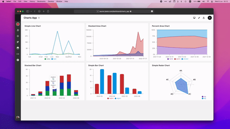
- Choose from 6 chart types: Simple Line Chart, Stacked Area Chart, Simple Bar Chart, Percent Area Chart, Stacked Bar Chart, and Simple Radar Chart
- Apply aggregation operators to Y-axis values (e.g., Sum, Count, Average)
- Add multiple series to compare datasets in the same chart
- Filter data within each series
- Customize series colors individually
- Set the analyzed time period and optionally group data by a date field
- Toggle legend and value-on-top display
Chart Types
Simple Line Chart — Plots values as a continuous line. Best for showing trends over time.
Stacked Area Chart — Displays multiple series as filled areas stacked on top of each other, showing both individual and cumulative totals.
Simple Bar Chart — Displays values as vertical bars. Best for comparing categories side by side.
Percent Area Chart — Shows each series as a percentage of the total, useful for visualizing proportional composition over time.
Stacked Bar Chart — Groups bars by category and stacks series values on top of each other.
Simple Radar Chart — Displays multivariate data on a radial axis, useful for comparing profiles across multiple dimensions.
Setting Up a Chart
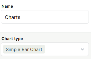
Step 1 — Add a Charts block to your app and give it a name.
Step 2 — Select a chart type from the Chart type dropdown.
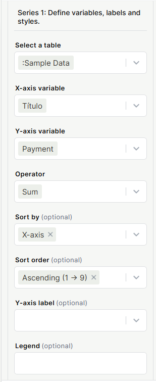
Step 3 — Configure the data:
- Select a table — choose the table to pull data from
- X-axis variable — the field used for the horizontal axis (e.g., a title or category field)
- Y-axis variable — the field used for the vertical axis (e.g., a number or currency field)
- Operator — how to aggregate Y-axis values (Sum, Count, Average, etc.)
- Sort by (optional) — sort by X-axis or Y-axis values
- Sort order (optional) — Ascending or Descending
- Y-axis label (optional) — custom label for the Y-axis
- Legend (optional) — custom label for this series in the legend
- Add a filter (optional) — restrict which records are included in this series
- Select a color for the series — pick the color used to render this series
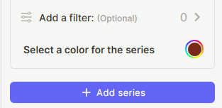
Step 4 (optional) — Click + Add series to add more datasets to the same chart. Each series has its own independent configuration — you can select a different table, X/Y variables, operator, filter, and color. You can also use the same table across multiple series and apply different filters to each one, which is useful for comparing subsets of the same data side by side (e.g., deals with status "Won" vs. deals with status "Lost").
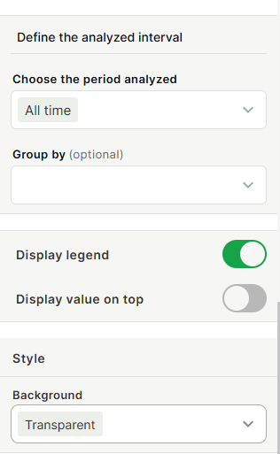
Step 5 — Under Define the analyzed interval, set:
- Choose the period analyzed — All time, or a specific time range
- Group by (optional) — group data points by a date field
Step 6 — Configure display options:
- Display legend — show or hide the chart legend
- Display value on top — show the data value above each bar or point
- Background — set the chart background to Transparent or a solid color
Step 7 — Click Save.
Use Cases and Examples
Sales tracking — Use a Simple Bar Chart with Month as the X-axis and Payment (Sum) as the Y-axis to see monthly revenue at a glance.
Pipeline composition — Use a Stacked Bar Chart to compare how deals are distributed across stages for different sales reps.
Trend analysis — Use a Simple Line Chart grouped by week to monitor how the number of open tasks evolves over time.
Proportional breakdown — Use a Percent Area Chart to see how the share of each product category changes month over month.
Keep in Mind
- The Charts block reads data from your tables but does not modify records.
- Filters applied inside a series only affect that series — they do not filter the entire chart.
- The Group by option only works when the field selected is a date-type field.
- Adding multiple series to Radar or Line charts is supported, but the chart may become harder to read with too many series.
- The Operator applies to the Y-axis variable only — the X-axis always shows distinct values.
FAQ
1- Can I add more than one series to a chart?
Yes. Click + Add series to add additional datasets. Each series is fully independent — it can pull from a different table, use a different variable, operator, filter, and color. A common use case is adding multiple series from the same table, each with a different filter, to compare segments of the same dataset in the same chart. For example: one series filtered to Status = "Won" and another filtered to Status = "Lost", both using the same table and Y-axis variable, will display the two groups side by side.
2- What's the difference between Stacked Area Chart and Percent Area Chart?
Stacked Area Chart shows the absolute values of each series stacked together. Percent Area Chart normalizes the values so each point adds up to 100%, showing relative proportions instead.
3- Can I filter the data shown in the chart?
Yes. Each series has an optional Add a filter option that restricts which records are included in that series.
4- Does the Charts block update automatically when my data changes?
Yes. The chart reflects the current state of your table data every time the block is loaded or refreshed.
5- Can I use the same table for multiple series?
Yes. You can add multiple series from the same table with different variables, operators, or filters to compare different dimensions of the same dataset.