
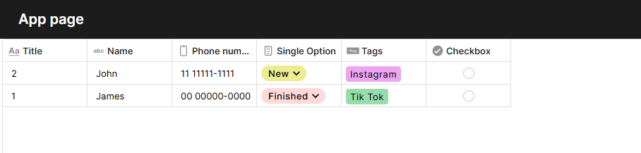
Table Block
The Table block displays a filtered, customized view of any table directly on an app page. It lets you control which fields are visible, how records are sorted and filtered, and how users interact with records — all within the page layout.
For instructions on how to add a block to your app, see the Blocks page.
Capabilities
- Display any table with a selected subset of fields
- Apply fixed filters and sorting to show specific records
- Customize visual style: background, gridlines, borders, row height, and frozen columns
- Assign conditional row colors based on field values
- Configure record creation and update forms with custom form sources
- Choose how records open using window style options
- Toggle read-only mode and data download per block
- Display connected records as inline rows beneath each parent row
Configuration
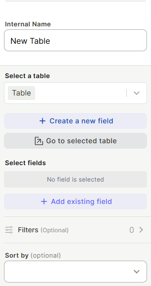
Internal Name — label used to identify the block in the editor. Not visible to users.
Select a table — choose which table this block displays. You can also use + Create a new field to add a field directly to the selected table, or Go to selected table to open the table without leaving the page.
Select fields — click + Add existing field to choose which fields appear as columns. Only added fields are shown.
Filters (optional) — add conditions to limit which records are displayed. Filters are fixed and not adjustable by end users.
Sort by (optional) — define the default sort order for records in the block.
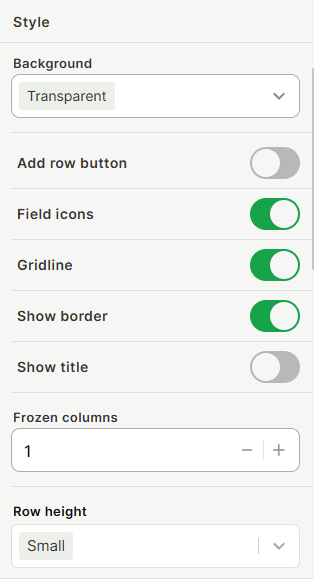
Style
- Background — Transparent, Color, or Blur.
- Add row button — show or hide the button that lets users create records directly from the block.
- Field icons — show or hide field type icons in column headers.
- Gridline — show or hide gridlines between cells.
- Show border — show or hide the block's outer border.
- Show title — show or hide the block title on the page.
- Frozen columns — number of columns that stay fixed when scrolling horizontally.
- Row height — height of rows (e.g., Small).
Conditional Rows Color
Add conditions to highlight rows in specific colors based on field values. Each condition has a color picker (Grid or Spectrum) and rule logic using When + Select a field + conditions. Use + Add rule or + Add rule group to build compound logic. Multiple conditions can be added independently.
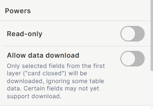
Powers
- Read-only — when enabled, users cannot edit records from this block.
- Allow data download — when enabled, users can download the table data. Only fields visible in the closed card (first layer) are included. Some field types may not yet support download.
Forms
Configure how records are created and updated from this block. For detailed instructions on building and editing forms, see the Forms page.
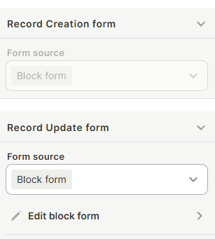
Record Creation form — defines which form appears when a user adds a new record. Form source options:
- Block form — a form specific to this block, editable directly via Edit block form.
- Import from app page — reuses a form already configured on the app page.
- Default table form — uses the table's default form.
Record Update form — defines which form appears when a user opens an existing record. Same form source options apply.
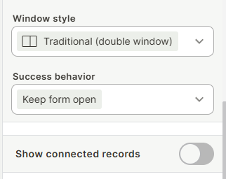
Window style — how the record form opens: Traditional (double window), Triple window, Quadruple window, Right side window, Full screen, or Wider form (double window).
Success behavior — defines what happens after a form is submitted (e.g., Keep form open).
Show connected records — toggle whether connected records are visible when a record is opened.
Connected Tables (Inline Rows)
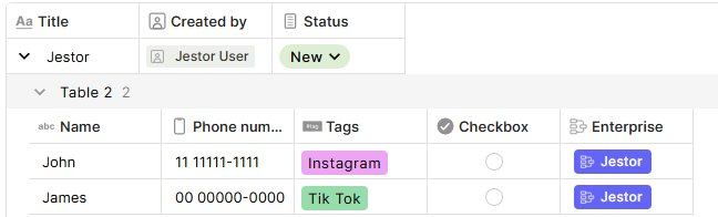
The Table block supports displaying connected records directly beneath each row, without opening the record. When enabled, each row expands to show a nested table of its related records from a connected table.
To add a connected table, open a record from the block and click + Add a connected table at the bottom of the record panel. Once added, the connected table appears as inline rows grouped under the parent record in the block.
Each connected table row shows the fields configured for that connected table. The Show connected records toggle (visible in the record panel) controls whether the connected rows are shown or hidden for that view.
This is useful for seeing related data at a glance — for example, viewing all line items linked to a deal, or all tasks linked to a project — directly within the table block layout, without navigating away
Keep in Mind
- Fields added to the table after the block is configured do not appear automatically — you must add them manually to the block.
- Filters are set at configuration time and cannot be changed by end users from the app page.
- The Allow data download option only includes fields from the closed card (first layer); fields visible only in the expanded record are not downloaded.
- Some field types may not support data download.
- The Add row button toggle controls visibility only — if table-level permissions prevent record creation, the button will not work regardless.
- Connected tables shown as inline rows are configured per record, not per block. Changes to which connected tables appear apply globally to that record type.
FAQ
1 — Can I display the same table in multiple Table blocks with different field selections?
Yes. You can add multiple Table blocks on the same or different pages, each configured to show different fields, filters, and sorting from the same table.
2 — Can users sort or filter the table directly from the app page?
Not directly on the Table block. Sorting and filtering are defined in the block settings and cannot be changed by users at runtime. However, if you want users to be able to filter the table themselves, you can add a Filter block to the same page and connect it to this Table block.
3 — What is the difference between Block form, Import from app page, and Default table form?
Block form is a form built specifically for this block and configured independently. Import from app page reuses a form already configured elsewhere on the same page. Default table form uses the standard form defined at the table level, shared across other contexts.
4 — Can I make the Table block read-only for some users and editable for others?
No. The Read-only toggle applies to all users viewing that block. To control access differently per user, you would need separate blocks or app-level permission settings.
5 — What does Frozen columns do?
It keeps the first N columns fixed in place while users scroll the table horizontally. Setting it to 1 keeps the first column always visible regardless of how far the user scrolls.
6 — What is the difference between connected tables shown inline and the Show connected records toggle in Forms?
The Show connected records toggle in the Forms section controls whether connected records appear when a user opens a record form. The inline connected table rows are a separate feature — they display related records directly beneath each row in the block itself, without requiring the user to open the record at all.