
Title Bar
The Title Bar displays the app page name and adds action buttons — like search and record creation — to the top of your page.
What is it
The Title Bar is a block fixed at the top of an app page with two purposes: showing the page title and offering quick-action buttons for users. It is the main navigation reference of any page, making it clear where the user is and what they can do from there.
When to use
Use the Title Bar when you want to:
Give users a clear visual reference for which page they are on
Add a button to create new records directly from the top of the page
Add a search bar to find records without scrolling through the page
Use a custom color to visually differentiate pages within the same app
How to configure
Step 1
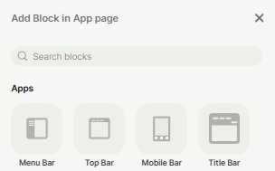
Add the block: In the app page, click the + button (or press F) to open the block picker. Select Title Bar.
Step 2
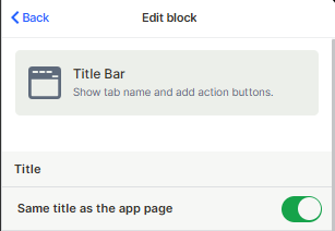
Set the title: In the Edit block panel, the "Same title as the app page" toggle is on by default. This makes the Title Bar automatically display the name of the current page. If you want a different label, turn the toggle off and type a custom title.
Step 3
Configure the bar style: Under Bar style, choose how the action buttons align: Left, Center, or Right. Right alignment is the default and works well for most layouts.
Step 4
Choose a bar color: Click any color in the grid or switch to Spectrum for the full color range. The selected color fills the entire Title Bar background. Useful for visually differentiating pages within the same app.
Step 5
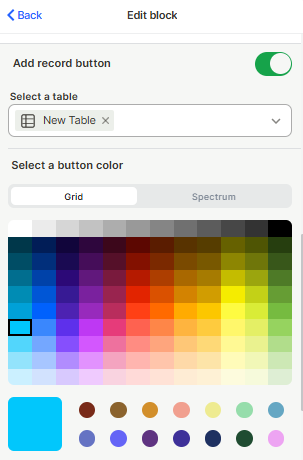
Configure the add record button: Toggle Add record button on if you want users to create new records directly from the Title Bar. With the toggle enabled, select the table where the new record will be created.
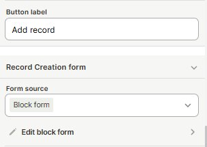
Choose a button color: Set a button label (if left blank, displays "+ Add record" by default).
Under Record Creation form, choose whether the form that opens comes from the block itself (Block form), from a custom form configured in another app (Import app page), or from the table's default form (Table Default Form).
Step 6
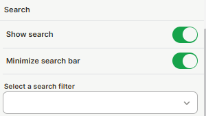
Configure search: Toggle Show search on to add a search icon to the Title Bar. You can also enable Minimize search bar to keep it collapsed until the user clicks it — this keeps the bar cleaner when search is not the primary action. Optionally, select a search filter.
Step 7
Save: Click Save to apply your settings.
Keep in mind
The Title Bar does not support multiple action buttons. Each page can have only one Add record button configured within this block.
The bar color applies to the Title Bar background only — it does not affect the rest of the page background or other blocks.
The Title Bar is designed to sit at the top of the page. It cannot be placed in the middle of the layout.
FAQ
1 — Can I have a Title Bar without showing any title?
Yes. Turn off the "Same title as the app page" toggle and leave the custom title field blank. The bar will still appear and you can still use it for action buttons and background color.
2 — What happens if I don't select a table for the add record button?
The button will not appear in the interface.
3 — Can I use the Title Bar search alongside a Search Filter block?
Yes, both work independently. The Title Bar search is a quick-access tool at the top; the Search Filter block is more powerful and allows filtering by multiple fields at the same time. Use both when the page needs both a quick search and advanced filtering.
4 — Does the "Minimize search bar" option hide the search completely?
No. It collapses the search into an icon. The user clicks the icon to expand the search field. The feature remains accessible — it just takes up less space in the bar by default.
5 — Can I use a different form for record creation through the button?
Yes. Under Record Creation form, change the source from Block form to a form created in an app, or to the default form for that table. This lets you control exactly which fields appear when the user creates a record through the Title Bar button.
Updated 4 months ago