
Simple Indicator
The Simple Indicator displays a single metric as a large number — ideal for tracking KPIs, totals, and goals at a glance. It supports sum, average, maximum value, and count operations, and can be scoped by time period or filtered by custom conditions.
For instructions on how to add a block to your app, see the Blocks page.
Capabilities
- Display aggregated data (sum, average, max, count) as a large highlighted number
- Filter results by a defined time period using a date field
- Apply custom filters to narrow the data scope
- Customize labels, colors, fonts, and layout
- Set conditional colors for the number or background based on field values
Configuration
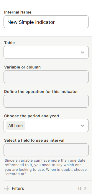
Internal Name — the name used to identify this block inside the app builder. Not visible to end users.
Table — the data source for this indicator.
Variable or column — the specific field you want to aggregate.
Define the operation — the calculation applied to the selected variable: Sum, Average, Maximum, or Count.
Choose the period analyzed — the time window for the data. Defaults to "All time." Other options let you scope results to a specific period such as the current month or week.
Select a field to use as interval — the date field used to filter by the selected period. Since a variable can have more than one date associated with it, you need to specify which one to use. When in doubt, choose "created at."
Filters (optional) — add conditions to restrict which records are included in the calculation.
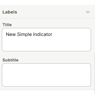
Labels
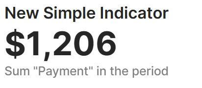
Title — the main label displayed alongside the number.
Subtitle — a secondary label, typically used to describe the metric (e.g., "Sum in the period").
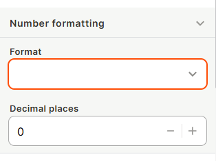
Number Formatting
Controls how the number is displayed, including decimal places, currency symbols.
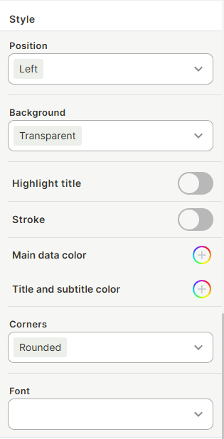
Style
Position — aligns content within the block: Left, Center, or Right.
Background — sets the block background color. Defaults to Transparent.
Highlight title — toggle to visually emphasize the title.
Stroke — toggle to add a border outline to the block.
Main data color — sets the color of the displayed number.
Title and subtitle color — sets the color of the label text.
Corners — controls the block's border radius: Rounded or Square.
Font — sets the font used throughout the block.
Conditional Colors
Conditional data color — changes the number color automatically when a condition is met. You can pick a color, select a field, and define rules or rule groups to control when it applies.
Conditional background color — changes the block background color based on the same rule-building interface.
Use Cases and Examples
- Displaying total revenue for the current month
- Showing the number of open support tickets
- Tracking average order value over a specific period
- Highlighting when a KPI drops below a target using conditional background color
Keep in Mind
- The Select a field to use as interval setting only applies when a specific period is chosen — it has no effect when "All time" is selected.
- Conditional colors override the static color settings when their conditions are met.
- The subtitle is not automatically updated when you change the operation — edit it manually to keep the label accurate.
FAQ
1- Can I use more than one filter at a time?
Yes. You can add multiple conditions in the Filters section to refine which records are included in the calculation.
2- What's the difference between "Main data color" and "Conditional data color"?
Main data color is always applied to the number as a static setting. Conditional data color overrides it when a defined rule is triggered.
3- What operations are available?
Sum, Average, Maximum value, and Count of records.
4- Can I display the indicator without a time period filter?
Yes. The default setting is "All time," which includes all records regardless of date.
Updated 3 months ago